
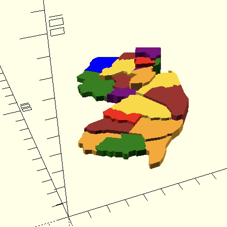
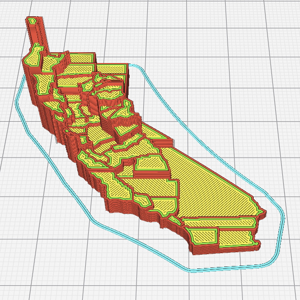
MapSCAD is a personal project inspired by my love of 3D printing and my recent interest in data visualization. I created a Python module, jsonscad_builder.py, that provides an API for building 3D printable choropleth maps from GeoJSON data.
See the project on GitHub and read the documentation.
These are some of the visualizations I made for a data visualization course (Yale CPSC 446, Data and Information Visualization). I used the d3.js library to generate these images. Note: Since these are homework assignments; I am not permitted to make the source code public.
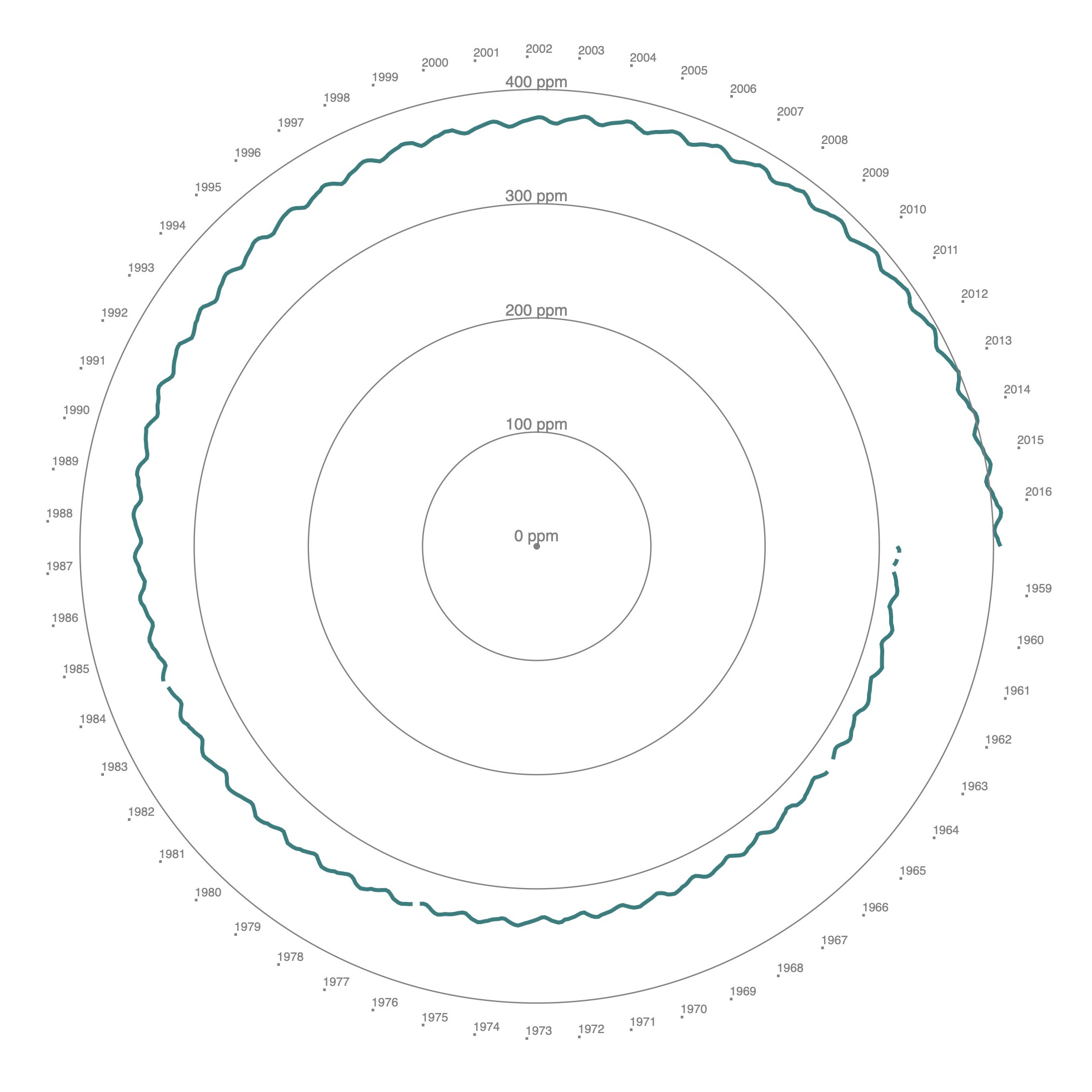
Carbon dioxide levels at Mauna Loa from 1958 to 2017, shown as a single cycle.
Data are from the following source:
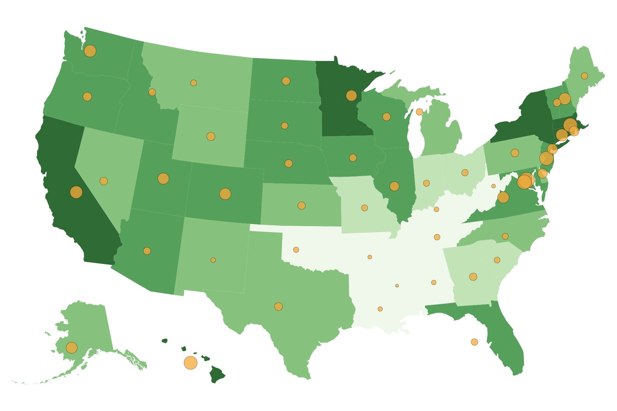
Each state is colored by life expectancy at birth. Higher values are represented by darker shades of green.
The radius of each state's centroid represents the median household income of that state. Higher values are represented by larger radii.
Data are from the following sources:
I built this website using pure HTML and CSS. This project was an exercise in responsive web design and patience.